
With first-time host cities, our goal is to design something that reflects them, and because this is our first logo, we took cues from what the NFL has chosen to represent from past logos: architecture, cultural legacy, and civic reputation and achievements to name a few.
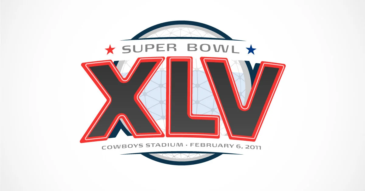
While researching Dallas (yes, it’s technically Arlington, but the rules say we default to the nearest team city), we came across a lot of usual symbols of Texas like longhorns, cowboy hats, belt buckles, lone stars, etc. Deep Ellum and vintage neon signs drew our eyes more specifically, but finally, we chose two iconic elements of the Dallas skyline.

Pegasus and Reunion Tower
The roman numerals are inspired by the flying pegasus sign, and the field behind them bears a texture that represents the Reunion Tower that joins the pegasus and are indicative of the Dallas skyline.
We opted to simplify the neon treatment on the numerals to maintain stronger visual fidelity at multiple sizes with a rendering that is more unifying visually the context of the logo, and because it hewed closer to the overall language the league has established to this point.

One thing we’re keeping mind going forward is not weaving the location and date text too deeply into the layout. Removing it for the jersey patch opened a bit of a can of worms in the balance and movement of the overall logo.
Next week, we head to Indianapolis and pay homage to legendary piece of sports lore..