Jump to:
Version 1 | Version 2
This seems to be the year that the official Super Bowl logo established itself as the front door to a wider experience. Using the rich color scheme, executions like this, this, and these tickets are pretty cool. Unfortunately, the entire execution doesn’t feel entirely unified, so points to the league, but our work keeps going.
We’re taking a new approach this year. Instead of creating a brand new original logo, we’re using the official logo to do two things:
1. Take the core conceptual elements of the official logo and reimagine them in the same spirit as always (we’ve already done an original Arizona-based logo anyway).
2. Address a few pain points in the official logo to turn it into a version we think is a more polished composition.
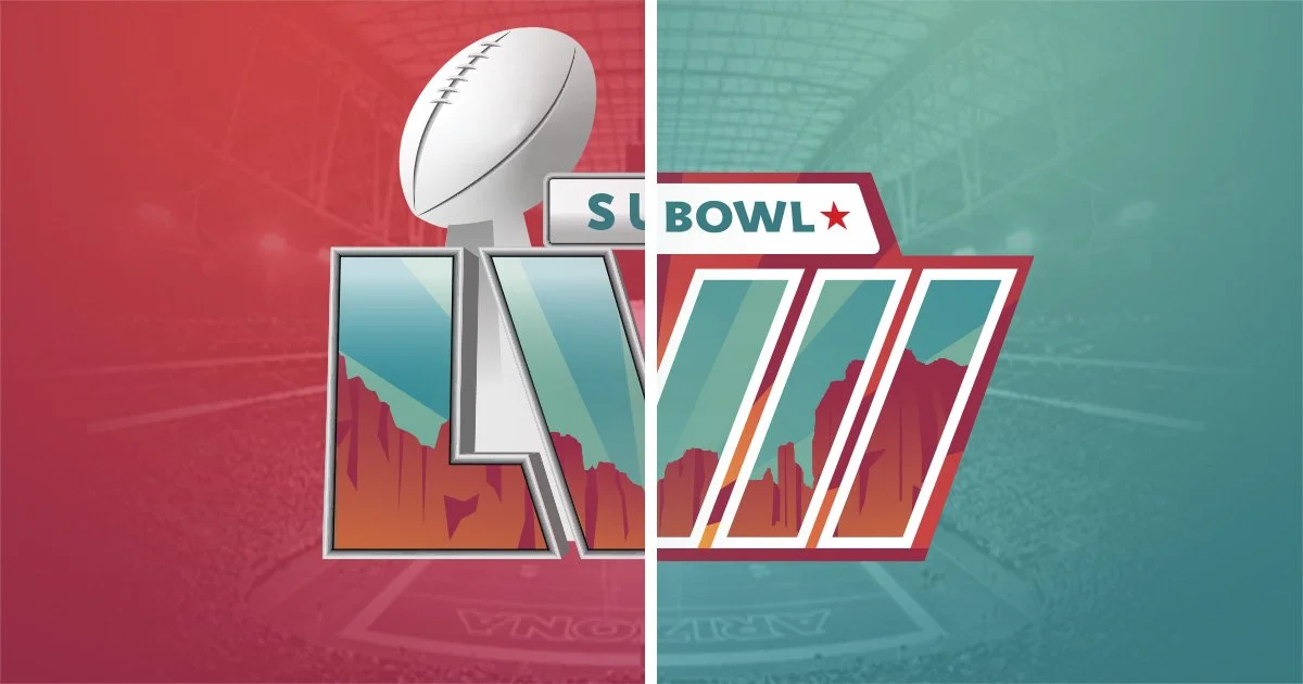
Version 1

For this version, we kept the official logo’s canyon-over-state-flag-starburst concept and color palette, and created a new logo in the spirit of the eras we all love.
To do that, we first adjusted the colors from cooler pinks and purples to warmer reds and oranges to better represent Arizona’s climate. We kept the canyon on teal starburst in the positive space of the numerals and put that on top of a contrasting red and orange starburst in the background.
For a more interesting numeral-centric composition, we angled the bar of the L into the negative space toward the V, and that snowballed into angling the rest if the numerals in for balance. That created a nice rhythm with the outward and upward movement of the starburst, which the “Super Bowl” copy counters, funneling back down to the numerals for a closed badge-type logo.
Version 2
The official logo has a handful of spots we thought could be addressed differently. We identified those as:
The trophy being behind the L but in front of the V creates contrast issues with the chrome, making the left spur of the V seem awkwardly thin.
The color scheme is a bit oversaturated and clashes slightly (like where the purple hits the darker teal in the upper right).
Technically, this layout says “Fifty-Seven Super Bowl,” which annoys us, so we’ll make “Super Bowl Fifty-Seven” work.
All that looks like this:
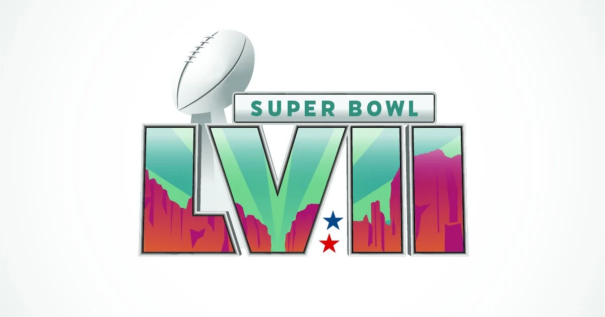
We addressed each trouble spot by:
Moving the trophy to the back to eliminate the contrast issue and add to the scale of the whole composition.
Adjusting the canyon colors from cooler pinks and purples to warmer reds and oranges to better represent the Arizona’s climate. The background motif of Arizona’s flag stayed largely the same, but we removed the transparency over the canyon shapes – effectively moving it behind them – to add some depth and avoid any awkwardness or tension.
Moving “Super Bowl” to the top of the composition, and balancing it with the trophy across the width of the logo.
Additionally, the bar of the L is angled to use more of the the space between it and the V (which is likely why the trophy is where it is in the original), and we added the usual red and blue stars that represent the two conferences. It’s a fun small-stakes challenge to find an interesting spot for them in each logo.
We did stop short on the chrome effect and reflections. They take enough time that getting the idea across was enough for us.

One more thing...
Around 3 weeks ago, we came across this video from creativebobbie where he created a great logo with a similar composition to this one. The bones of the two designs are obviously very close, but the concepts and executions are quite different.
Typically, we finish design in early November and start putting together other stuff like jersey or field mockups, so our primary creative wrapped up awhile back. It’s a case of independent but parallel thinking.
We exchanged a few messages. All is good. Sometimes this stuff just happens.
Thanks again for reading, and enjoy the game! Bears by 50.