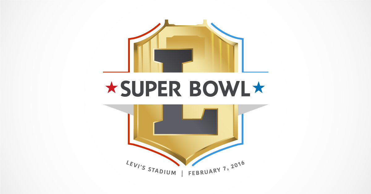
The main goal of this project is creating new work we think the NFL would have done had they stayed the course with original creations. Keeping that in mind this week, we took a slightly different approach to Super Bowl L.
wikimedia.org
During the 2015 season, the NFL used a gold shield logo to commemorate its 50th Super Bowl, so our approach included a beveled gold shape with black to echo the season-long campaign. Of course, we couldn’t resist including the golden gate bridge to signal San Francisco as well.
It’s a slightly more cynical approach on our part, going in-step with the league so far as to even use a font similar to its standard with the roman numeral L. But after experimenting with a lot more abstract concepts, we found out there’s a lot more character and better relationships in the numeral forms with Is, Vs, and Xs, so we narrowed our focus a bit.
There are some more modern elements to this one too. The band containing the typography cutting through the middle and the red and blue runners on either side of the gold field are, if we’re being honest, very much of a type with our style (if we have one) so far on these.
Unlike the last two logos, this one went through quite the journey. We’ll share the concepts on social, but the biggest thing we discovered is why the NFL opted for 50 instead of L. Difference is we didn’t get scared.
Next week, we take a little pivot as we move on to Houston.


